How to use Excel to make a wireframe | by UX Monster | Medium
How to use Excel to make a wireframe
Recently I am working on a project about search. To display the search result more consistently, I also design different templates for the search results. Indeed, as a UX designer who always use Sketch to design, it would be much easier to use Sketch to make the templates as well. Yet because the contents in the templates are continually changing based on the business requirement, I found it a bit time-consuming to modify the materials again and again with Sketch.
Fig.1
For instance, if we look at the contents in Fig.1, what would be the most critical information for the users if they want to book a flight? Would that be the departure time? Or the destination? Or maybe the price? For different scenarios, the information prioritization will be different.
Therefore I have the idea to design a low fidelity wireframe library with Microsoft excel. Not perfect, still in progress, and I am sharing the process so that you can feel free to provide any of your suggestions.
1.Design the template
1.1.Collect the contents related to specific industries
Before getting start to design, we first need to have the contents. It could be from the product manager’s documents or other apps or websites. For instance, if I want to have the contents about flights, I can go to travel apps or flight booking websites. Also, I can have a look at my previous flight tickets as well. Then all the contents will be listed in the excel.
Fig.2
1.2.Set the grid and spacing
Now we can start to do wireframe. Now we need to create another excel table so in all we have two excel tables. One is for the contents, and the other one is for the wireframe. Let’s temporarily name them content table and wireframe table.
Then the row height and column width can be adjusted based on your design preference.
Fig.3
I personally would like to make it denser, so that the layout can be more flexible.
Fig.4
1.3.Layout
Then we can define some typical layouts to organize the contents. Following are some standard layouts I usually use, just for reference:
Fig.5
2.Data Linkage
2.1.Create the connection between the two tables
Now we need to build the connection between the two tables. With a simple formula “=content table!B1”, the data in the content table can be linked to wireframe table.
Fig.6
2.2.Quick duplication
Drag the cell in the table, and we can quickly duplicate the contents. And this enhances the efficiency for creating pages with similar contents, such as settings of the phone, news feeds and contact lists.
Fig.7
2.3.Flexible content
Here is another trick. In excel, we can create some flexible contents for number or date, which saves us the time to modify the data manually.
Fig.8
Fig.9
3.Beautify the wireframe
3.1.Information hierarchy
With the previous step of data linkage, we can create a link between the two tables and create the basic layout.
Fig.10
Then we can play with the font size, boldness to display the content.
Fig.11
3.2.Color and icon
We can continue by adding more colours and icons to beautify the wireframe.
Fig.12
One thing to mention is that all the images and icons used here are the default emoji in the Mac system. Mac system has a rich library of emoji, which contains icons, avatars and some other elements related to our daily lives.
Take a look at the following wireframe, the icon elements on the left-hand side are the default emojis in the system. We can use the hotkey ctrl+command+space to bring out the system icon library.
Fig.13
Following are some emojis I frequently use for wireframe design. Hope this can be helpful for you to create the wireframe next time.
Fig.14
Summary
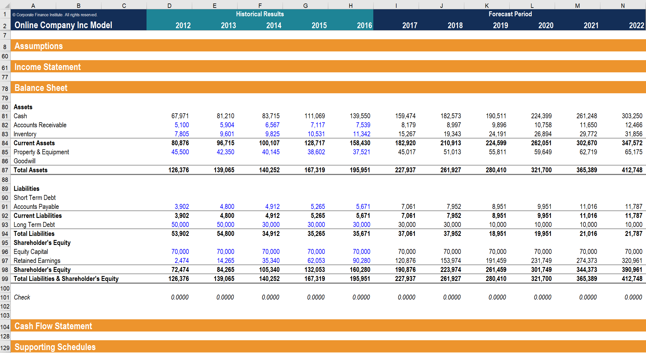
These are what I have designed with excel:
Fig.15
I found that the other advantage using excel to design is that the excel document can be modified by all the relevant team members, including the product manager, developer and the visual designers as well. The product manager can feel free to edit the contents, and then they can instantly see how the interface looks like in the other table. For the visual designer, they can feel free to copy the materials they want from excel instead of opening another large size sketch wireframe file.
These are some of my insights about wireframing, hope you like it!
17
More from UX Monster
Follow
Share the insights about UX design
Bendable Screen Interaction
Recently, the foldable screen has become a new tendency in the mobile industry. With interest in this area, I have researched for some technologies and products in the relevant fields. And I feel especially interested in technology using bending as the primary interaction method, and I will share that in this article.
Following are some typical products to mention when we talk about the foldable product. In 2011, there is a product called Paper Phone made of paper with many sensors inside. And people can bend this phone for navigation. In 2013, a new product called Samsung Galaxy Round was…
50
Post a quick thought or a long story. It's easy and free.
[UX insight]When the keyboard pops up
The main reason why I want to share this article is that in my recent project, I found that whether it be developing a low-fi prototype or discussing with the group, more often than not we will be distracted by a small keyboard:
While the page is loading, should we pop up the keyboard?
What’s the relationship between the keyboard and the text field?
When the keyboard pops up, should we still offer the voice input entrance?
It goes without saying that the keyboard is important as one of the media we tackle frequently every day. Every time we generate…


