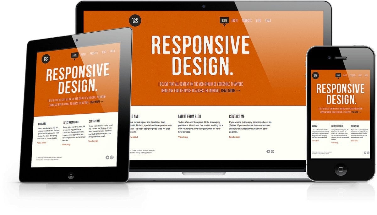
What is Responsive design for Website and What is the Need for it?
What is Responsive design and Why should you have responsive design?
Now everything like services, education, portfolio everything is serving/selling to the customers online through the websites, and a website’s design matter a lot for our businesses. Today, in this article, I am discussing related to the website design which is also known as page layout, website layout or web layout.
So, what is website design?
Website design is the overall design/interface of the website that contains creation, information, the architecture of the website. Everything on the website that going to be represented online.
There are two types of web designs (page layouts) for the websites,
- Fixed layout/design
- Responsive layout/design
Fixed Design
The website which has fixed design always has the same width on all devices like Desktop, Mobile or Tablet. It does not automatically fix according to the device width.
Responsive Design
Responsive Design/layout works according to the screen width, it automatics fix according to the device’s width.
Table of Contents
Let’s understand why it is important and what’s the need for responsive design?
Nowadays responsive design is the main or important thing in the website industries because of search engine and website user interface need. Now, most of the users browse the websites on personal devices like Mobile, Table and the width are not fixed for all devices. So we need a specific design which can work on all devices. And the solution is “Responsive Design”.
Responsive Design is necessary to avoid resizing the screen, zooming the content, scrolling the screen that can occur on different devices with a fixed layout.
To convert/make a website in Responsive Design is not tough now, it can be easily implemented by using CSS, even if you are not a developer you can use some of the free libraries to make your website’s design responsive.
Why is responsive design important?
1) User interface – User interface matters for the User and Search Engines, if your website’s user interface is not good, the user will not visit the website. So it is important for Users and Search Engines that website’s layout must be Responsive so that you can put the content that you are providing for the users.
2) Content readability – A fixed design (which I have discussed above) can work on Desktop only and the content can be read on Desktop. If we open a website with fixed design on Mobile and Tablet, the width will be the same.
For example – if any website has fixed design with 1200px width and we are opening it on Mobile Device, mobile devices screen width is around 300px to 400px (if we talk about resolution of the screen – website may open but content will be very small and user needs to zoom the content that will be very irritating) and no one can read content which is written for 1200px on 300px to 400px device.
While a website with responsive design easily increases the size of the content and automatic fits the content according to the device width. Then the content on the responsive layout can easily read.
3) Revenue – As we know that most of the websites earn through the advertising, and the advertisement placed on the fixed design website will be fixed on other devices too. Thus, the advertisement will not display properly to the user and website will lose their revenue.
While, a website with responsive design can able to fit the advertisement automatically, where a user can see them and you may still earn from other small devices likes mobile, tablet etc.
4) Search engines (Google) requirement – Now almost all search engines (especially Google) recommend that your webpage must be responsive to get it ranked. There are many factors about that one of them I have discussed above that Mobile devices traffic is increased and to provide good content to the users, Google recommends it.
Your website’s pages must be responsive to rank any webpage in the Google.
Benefits of the Responsive Design
Come to the benefits of having a responsively designed website,
- As we know that for a new website it is important to get ranked, if the new website is not ranking in a good position, you may not get traffic. So, to get good ranking – your webpage must be Responsive, which Search Engines recommend.
- A responsive website is able to put the content, images etc to the Reader’s device in a flexible way.
- With a responsive design – you do not need another mobile version website. It will reduce the development and maintenance cost. The same page with the same content will be for all devices.
- Website speed – If a website designed responsively by using optimized CSS, images, it will load fast.
- The nowadays responsive website is the need of industry and it gives to the positive value to your brand.
Principles behind the responsive design
Coming to the principles of responsive design, what makes the web design responsive? There are following the main concept behind it…
- Flexible width – While defining the width of an element, we use it in percentage. We should not make it fix. Flexible width is the most important thing in responsive design it automatically adjusts the webpage’s width according to the screen width.
- Fluid grids – In fixed design, tables were used and tables (without any responsive property) are fixed, they were not able to adjust their selves according to the width.
While responsive layout uses “Fluid grids” which are auto adjustable according to the screen width. (Let’s try to understand the technique behind the “fluid grids” – to create these fluid grids, we use DIV(s), DIV is an element which is used to contain something in the HTML and its flexible width. By using the DIV with the flexible width (in the percentage of the screen), we can create these “Fluid Grids”.
- Fluid Images – These are just the flexible width property based concept. When we define the image’s width in percentage of the screen. Images are also able to resize according to the screen width.
There are some other factors which matter in the responsive design like media queries etc. But the main and important thing and fluid and flexibilities, each element must have flexible in width.


