How to create balanced page layouts | Creative Bloq
How to create balanced page layouts
By Sam Hampton-Smith (Netmag) September 14, 2020
Whether you’re designing page layouts for print or online, apply these principles to ensure balance.
The primary objective of any page layout you design, whether it's for a printed brochure or the latest web app, is to communicate information clearly and effectively to the reader. One of the best ways to ensure that the key messages are delivered to the reader is to create a balanced page layout.
Page layout design typically involves a lot of placement, rearranging and formatting of elements. Many designers approach this process organically, feeling their way to a pleasing end result. While this can lead to some excellent happy accidents, there is a risk that using a free-form methodology can result in a lack of visual balance on the page.
A good page composition should be both pleasing to the eye, and also communicate those key messages clearly to the intended audience. We've collected together some top tips to help you ensure your page layout designs have balance (a good website builder will also help). These approaches will work well to provide a structure for balance, regardless of the medium you're working with.
For more web-specific advice, see our guide to creating perfect website layouts.
RECOMMENDED VIDEOS FOR YOU...
Please close pop-out player to resume playback.
01. Use a grid
One of the easiest ways to ensure your page has a degree of balance is to use a grid system. Grids used to be the sole preserve of the printed page, but much work has been completed online in the past few years to help migrate the concept of the grid across to the digital medium.
By using a grid to inform the position of different elements on a page, you'll create a connection between the different elements that make up your page. This can help provide a sense of order to your layout, providing the reader with a clear structural reference to fall back on, and increasing the success of your page.
This is important because when all your page elements have a feeling of connectivity with each other, the overall effect feels more comfortable to the reader, helping to put them at ease, and facilitating their access to the important stuff: the content.
02. Choose a single focal point
One of the most effective ways to provide a sense of balance is to choose a single focal point for your layout design. A good example of this in practice is the use of a large image as the biggest single element on a page.
A strong visual can provide a powerful way to lead the reader into your page (as can the expert analysis of the ideal web hosting service), and also supplies a useful structural element around which to arrange the remaining content in your layout. If you have multiple visual elements, use the proximity principle of Gestalt Theory to group them together, aligning them in the same way.
It's also worth keeping in mind that you can use a headline or pull quote in the same way; a good display headline can offer as much visual interest as an image, while continuing to provide the structure that will help you ensure a balanced layout.
03. Use the Rule of Thirds
One of the best ways to provide a sense of balance is to use the designer's favourite Rule of Thirds or Golden Ratio. Put simply, the rule of thirds says that if you divide your page into thirds both vertically and horizontally, the points at which the grid lines intersect provide the natural focal points of a composition.
By aligning your key elements to these four points, you'll achieve a more pleasing composition than if you, for example, perfectly centre elements on your page.
In itself, the rule of thirds won't magically provide your layout with balance, but by extending the principle, it's easy to use this tendency towards a natural focal point to help inform the balance of your layout.
Advertisement
A common approach is to place the most important elements of your page in the upper (or lower) third of the page, with the primary focal point aligned to match one of the intersections. Got lots of assets to store for your site? Check out these cloud storage options.
04. Use white space
It's common for novice designers to make use of every single bit of space on a page, stuffing in content until every gap has been filled. The more experienced know that sometimes the best bit of design involves leaving elements out, rather than shoehorning them in.
In the printed medium, the most common way to make use of white space is by enlarging the page margins and gutters. On the web, simply providing plenty of breathing room around elements can help make your layout design feel composed and balanced.
Using negative space works best when you have a clear structure that anchors content together (such as that provided by a grid), as the risk of white space can be a sense of disconnection between page elements if introduced haphazardly.
05. Repeat design elements
Advertisement
Repetition can also provide a strong sense of connected design and balance to a composition. The idea is that by identifying and re-using a motif or design treatment throughout your layout, you can provide a reference for the reader so that disparate areas feel connected and part of the same overall composition.
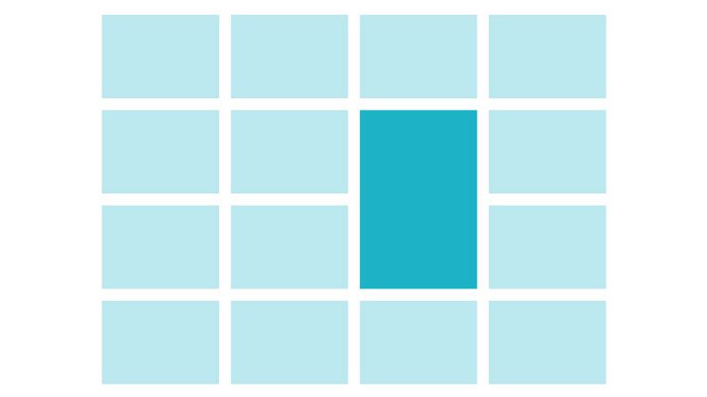
You can also use this technique to provide a focal point in your design, while retaining an overall balance, by intentionally breaking the pattern of similarity introduced through repetition.
06. Use hierarchy
One of the key approaches to achieving page layout nirvana is a clear sense of structure and hierarchy. We've already touched on structure, but it's important to also convey the relative importance of different pieces of content on your page. A headline, for example, should almost always be more visually important than body text content.
Look at the different elements that make up your layout design and decide which element is the most important. Use this element to provide a structural hook for the remaining elements on the page, keeping it the most important.
07. Use scale, contrast, and harmony
Advertisement
Finally, the use of scale can be a very effective method for achieving a good visual balance in your layout. By making some elements larger than others, a sense of order and hierarchy will emerge. This helps create a comfortable layout because the viewer will automatically look at the larger elements within the layout first, progressing through to the smaller elements as they read.
This principle also works with increased contrast, so that by isolating an element on the page through contrast will make the eye focus on that point first. This provides a way in to the page, and again gives a useful structural point to develop your layout from.
Both scale and contrast work best when they apply to one element, making it stand out from the other parts of your layout. Use the principles of harmony to make the others feel connected and accentuate the focal point.
Related articles:


/GettyImages-467174671-56ae63993df78cf772bb8197-5c6d6ba146e0fb0001fc6368.jpg)


