
Data Visualization Course | Data Visualization Tutorial | Data Visualization Explained | Simplilearn
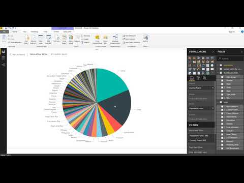
This Data Visualization full course will help you learn how to make sense of data and create interesting reports and dashboards. You will create visualizations using Tableau, Power BI, Excel, R, and Python. This video will make you understand data better and draw meaningful conclusions. Dataset Link - https://drive.google.com/drive/folders/1IqXQ6bx6ElxxI9YWuoeY8vqo3deEBZUZ Below are the topics covered in this video: 00:00:00 Data Visualization using Tableau par1 02:16:43 Data Visualization using Tableau par2 03:12:05 Tableau Dashboard 04:32:05 What is Power BI 04:48:49 Power BI Dashboard 05:45:26 Excel Dashboard 06:55:39 GGPlot2 Tutorial 07:24:09 Matplotlib Tutorial Dataset Links: https://drive.google.com/drive/folders/1Lhwkz7UAF6se48AvZO_vKgb72XY_NiBF https://drive.google.com/drive/folders/18BFipLUm5pUcsjmjDKGg2dBR_I6mZzPX #DataVisualization #WhatisDataVisualization #DataVisualizationTutorial #DataVisualizationCourse #TableauDataVisualization #PowerBIDataVisualization #ExcelDataVisualization #Tableau #Excel #PowerBI #Simplilearn What is Power BI? When looking for the answer to “What is Power BI?”, we need to look no further than the tool’s creator, Microsoft. The company defines Power BI as “…a collection of software services, apps, and connectors that work together to turn your unrelated sources of data into coherent, visually immersive, and interactive insights.” The BI stands for “business intelligence,” and the tool gives non-technical users all the resources they need to aggregate, visualize, analyze, and share data. The business world considers Power BI one of the best drag-and-drop tools available in the industry today. To learn more about Power BI, check ourFREE Power BI Course: https://www.simplilearn.com/learn-power-bi-basics-free-course-skillup?utm_campaign=DataVisualizationFullCourse&utm_medium=Description&utm_source=youtube What is Tableau? Tableau is a leading data visualization tool used for data analysis and business intelligence. Gartner’s Magic Quadrant classified Tableau as a leader for analytics and business intelligence. This Tableau tutorial will cover a wide range of how-to topics, including how to create different charts and graphs, in addition to visualizing data through reports and dashboards in Tableau to derive meaningful insights. To learn more about Tableau, check ourFREE Tableau Course: https://www.simplilearn.com/learn-tableau-online-free-course-skillup?utm_campaign=DataVisualizationFullCourse&utm_medium=Description&utm_source=youtube What is Excel? Excel is a powerful spreadsheet application created by Microsoft which helps you to understand and analyze business functions. This application is mainly useful for business heads for taking decisions about their business. Microsoft introduced a number of new features in Excel 2013, such as saving files in remote locations, new chart types, slicers and timeline feature to work with pivot tables, FlashFill, etc. All these features allow the user to work with data more efficiently and effectively. To learn more about Excel, check ourFREE Business Analytics with Excel Course: https://www.simplilearn.com/learn-business-analytics-excel-fundamentals-skillup?utm_campaign=DataVisualizationFullCourse&utm_medium=Description&utm_source=youtube For more information about Simplilearn’s courses, visit: - Facebook: https://www.facebook.com/Simplilearn - Twitter: https://twitter.com/simplilearn - LinkedIn: https://www.linkedin.com/company/simplilearn - Website: https://www.simplilearn.com - Instagram: https://www.instagram.com/simplilearn_elearning - Telegram Mobile: https://t.me/simplilearnupdates - Telegram Desktop: https://web.telegram.org/#/im?p=@simplilearnupdates Get the Android app: http://bit.ly/1WlVo4u Get the iOS app: http://apple.co/1HIO5J0
Comments
Related Posts

Data Visualization | Data Visualization Python | Intellipaat
Case Study on Data Visualization

Tools Used in Data Visualization ll Data Analytics ll Explained in Hindi
Data Visualization Basics [Hindi]
Top 10 Data Visualization Tools in 2020 | Best Tools for Data Visualization | Edureka