Case Study: Data Visualization for Social Media Data | by Lehel | Medium
Case Study: Data Visualization for Social Media Data
Project Brief
The work was for a product called Watson Analytics for Social Media (WASM). Like it says on the tin, WASM is a product tailored specifically for social media analysis — pulling in social media content from a number of sources, and surfacing insights around everything from trending topics, to sentiment analysis, key influencers, audience demographics etc etc… figures such as sales data can show how a product may be doing in a certain market over a period of time. Social media data can help give further context to that business data, enabling users to (hopefully) make more informed decisions.
Watson Analytics for Social Media has a number of custom visualizations tailored to surface specific insights and patterns. We’ll be looking at how our team redesigned one of these visualizations.
My role
My primary role on this effort was focused on planning, research, and design. I worked with our PMs and Devs to nail down requirements, translating them into user needs, and then working with my team on taking our designs from initial sketches and ideation, through to high fidelity designs and specs, which our dev team could then leverage to build out the visualization itself.
Laying the groundwork
A poster our research team put together to help communicate the high level details for our main persona.
The Persona (and what we’re trying to help her do)
The purpose of the visualization is simple. Help our persona, Natalie, compare data for 3 predefined user groups — Prospective Customers, Existing Customers and Dissatisfied Customers, and see what they are saying about the topics she’s defined. (Are the number of potential customers increasing? Are existing ones unsatisfied or leaving? If so, why?) This would allow her, to quickly do a competitive analysis, see where her company is strong, or alternatively where they may be struggling, and help her craft a business strategy in response.
The Usecase
To help put things in context, let’s say Natalie’s works at an auto manufacturer such as BMW and she needs to run an analysis on both BMW’s brand and products, as well as some of the competition. For this scenario our list will include
- Audi
- BMW
- Jaguar
- Mercedes
- Porsche
- and Tesla
Her execs want to know about a few things in specific, (we’ll call these themes). They want to know what people are saying about things like:
- Safety
- Power
- Price
- Self-Driving Capabilities
- Reliability
- Warranty etc…
Are these things driving sales? Is there an opportunity in any one of these areas that they can capitalize on? Between reviewing existing research data and doing our own explorations and inquiries, we boiled things down to the following.
User outcomes
- Compare: Natalie needs to be able to quickly compare data across the 3 groups of users, to see which group is the most active, and go from there.
- Drill in: Once she’s found a point of interest she needs to be able to explore her data by drilling into either a specific user group or a specific data point, getting further information about her selection. (Sentiment breakdown, demographics etc…)
- Discover: Natalie should also be able to discover new insights and see what else her customers are talking about that isn’t captured in her list of defined themes.
The above three user outcomes would become the core of our UX Requirements.
Understanding the data
The next step was actually gaining a thorough understanding of the data. Answering questions such as:
- What kind of data are we gathering from each post and each source?
- What do we know about the author of each post?
- Could we gather info about __________ ?
- What’s the single most important piece of information or insight our users want from this chart? What about secondary info?
As we gained a better and better understanding of the data itself, it was time to start coming up with ideas.
Ideation
Sketching
We started by doing a few rounds of sketching and paper prototyping. We figured it would be good to get some fresh eyes on this and leverage some of the talent in our studio, so we pulled in some other designers from different squads. This is where working within a broader design team really comes in handy.
After a few iterations we converged on 3 approaches and reviewed them with the rest of the product team. The feedback was the following.
Bubble / Bar Matrix
Eagle eyed readers will notice that we decided to have some fun in this sketching session and switched to a Star Wars theme for our mock data.
Pros
Being able to scan across groups as well as individual columns or rows makes it easy to compare data across a number of metrics and quickly find outliers.
Easy to show secondary information such as sentiment or demographics breakdown by turning each bubble into a pie chart.
Cons
Showing sentiment or demographics by default may make things very busy.
Still need a way to show conversations not captured by her themes.
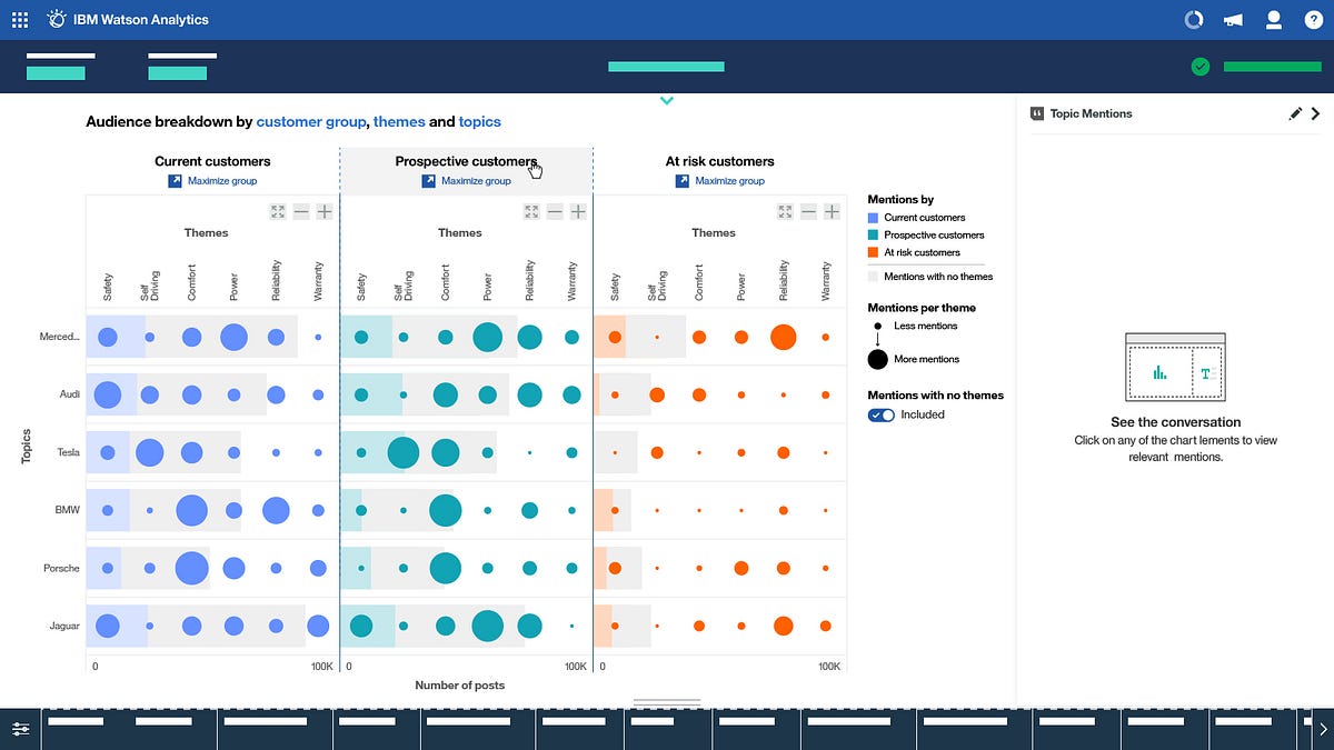
Donut Chart with themes toggle and “Related Viz” Panel
Left: Default state. Middle: Toggle showing number of comments without themes. Right: Drilling in to a specific part of the chart to show related visualizations.
Pros
Nice left-to-right progression in terms of granularity of data with a clear CTA for exploration.
Chart gives quick, easy to understand breakdown of each Topic’s prominence within a User Group.
The toggle helps the user control if they want to see content with no detected themes in their visualization or not. (Seeing this data can be valuable, but it can often also skew things).
Cons
Lack of ability to quickly compare across groups.
May be a bit too simplistic.
Stacked bar charts
Pros
Tabs make it easy to switch between groups
Stacked bar charts provide an easy way to compare secondary info (such as sentiment) across themes / topics.
Cons
No way to compare across user groups side by side
May not scale well to a large number of topics or themes.
May break down if the user hasn’t defined any themes.
Converge
After a few more rounds of lo-mid fi designs and reviews we started to converged on a single solution that leveraged some of the pros of each option. We did away with the bar graph cause frankly — it’s often times the easy solution and our product was already had a bunch of bar graphs… and we wanted to do something more interesting.
Same interaction pattern as above, just with a bit more detail.
For the first option, we added the tabs from the bar graphs design, and added in our “Mentions” panel, which shows pieces of content and conversations related to your selected datapoint.
For the second option, we added in the same mentions panel and the “related visualizations” panel, which would come up from the bottom once the user has drilled into a datapoint. Testing things internally as we went along, we continued to refine our approach. We also added a bar-graph overlay on each row, to show the accumulative sum of conversation happening around each brand for each user group.
In the end we converged on Option 2, with the benefit of highlighting both patterns and outliers being the key difference that tipped the scales in its favour.
Moving to Mid-High Fidelity
Once we had settled on a solution, we moved from low to mid fidelity designs to help nail down some of the interaction patterns, sizing and spacing.
I’ve found working at mixed fidelity like this really beneficial when doing design reviews. Parts of the UI that are not important to what is being designed for right now are abstracted out, while the key points of focus are mapped out in more detail. I’ve found this helps:
a) Keep teams focused during a review by removing noise from the UI. And it also keeps people from going down rabbit holes about “the label on that button there that has nothing to do with what we’re reviewing, but someone in the room has really strong opinions on”.
b) Make my life easier because I don’t have to make up unique copy for each item, which I then have to make sure stays consistent throughout.
At this stage we also decided to decrease the scope of our MVP, and leave out the Related Visualizations panel. If we were going to introduce the feature, we figured we should do it right and bring it in as a more high level enhancement, that’s available for all charts within our product, rather than just this one.
Specs
Last but not least, once the general layout, interactions and visual treatment were locked down, I moved on to speccing things out in detail. The full design spec ended up being over 30 pages long. Dissecting that page by page is a bit outside the scope of this case study, but these snapshots should give you an idea of what the rest of the specs looked like.
Reflection
The IBM Design Thinking Loop
This was an interesting new challenge for me. Most of my work tends to have more of a traditional UX/UI focus. This project helped me take some of those same skills and tools, and apply them in a new domain. While data viz design has its unique challenges, it was reassuring to see a lot of the same processes’ used in more traditional “UX Design” work equally well here.
- Understand the user
- Understand their problems, tasks and desired outcomes
- Work with Dev and PM to understand requirements, resource and technical limitations, and explore possibilities.
- Ideate as a team. Diverge to explore options, then converge on a solution.
- Research and test as much as your situation and timeline allows.
- Figure out what’s needed for a Minimum Viable Experience, and build a roadmap for how to ship that and then move beyond.
- Flesh out the details as you move along that roadmap. Adjust as needed.
Or as the key principles of IBM Design Thinking state, Observe, Reflect, Make.
Lehel
Product Designer and Frontend Dev. Part time whiskey snob, full time geek. Hopefully leaving the web a little nicer than I found it.
Follow
LEHEL FOLLOWS
26
Comments
Related Posts
Data Analyst Roles & Responsibilities | Data Analyst Skills | Data Analytics Certification | Edureka

How to Become Data Analyst | Data Analyst Skills | Data Analyst Salary | Intellipaat

Data Visualization using Python on Jupyter Notebook

How to Build Your Data Visualization Skills
Top 10 Data Visualization Tools in 2020 | Best Tools for Data Visualization | Edureka